
Brief: Create a brand identity for the new pizzeria 'Lazy Frank's' including logo, signage, pizza box and any other roll out. To be completed in a week
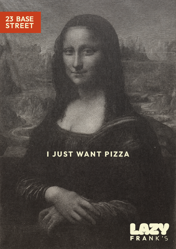
Concept: Hey Mona Lisa, you looking a bit glum chum, I think you might be a bit Hangry. Pizza? Get to Frank's, classic pizza, kept simple, done well, Leonardo would agree.
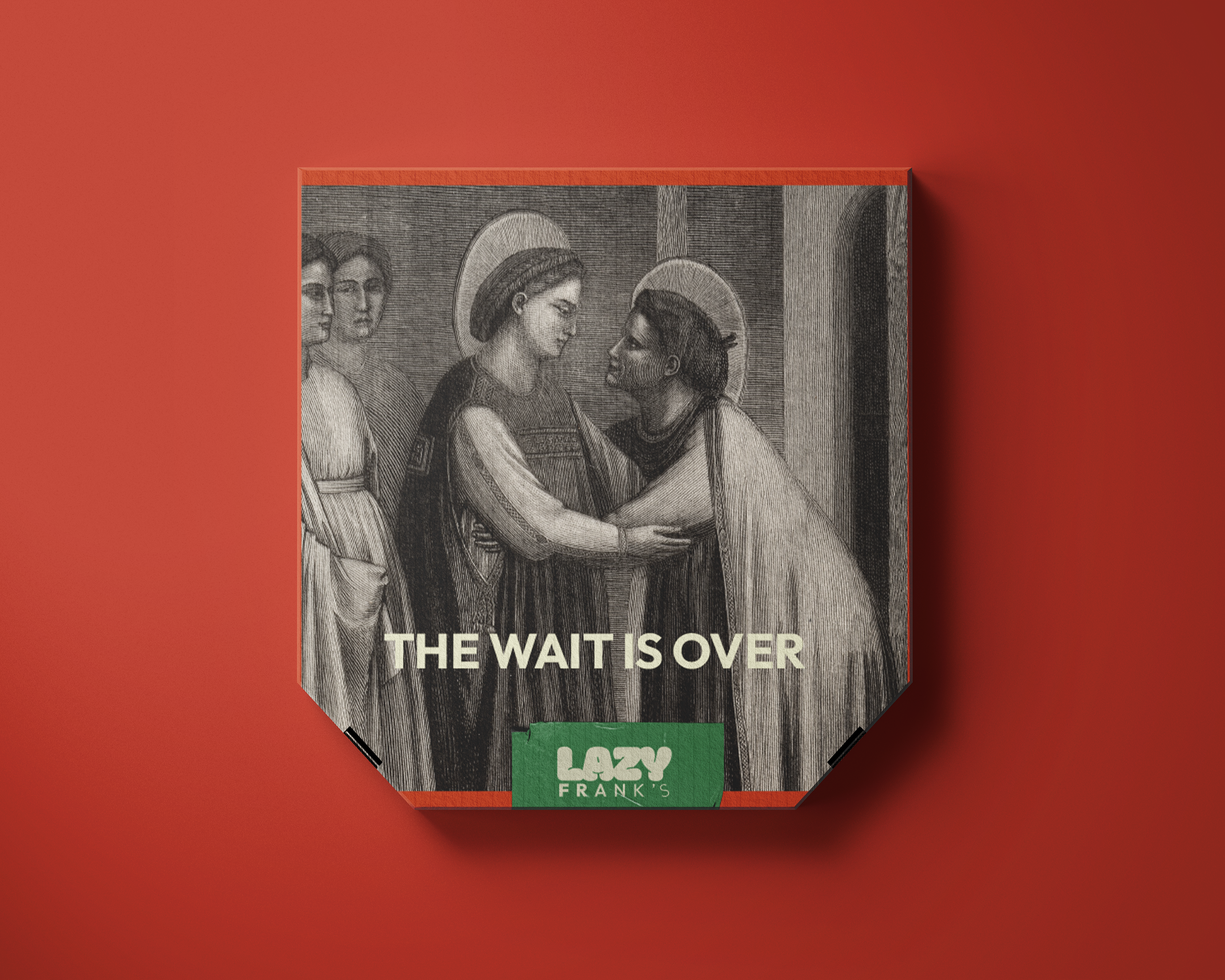
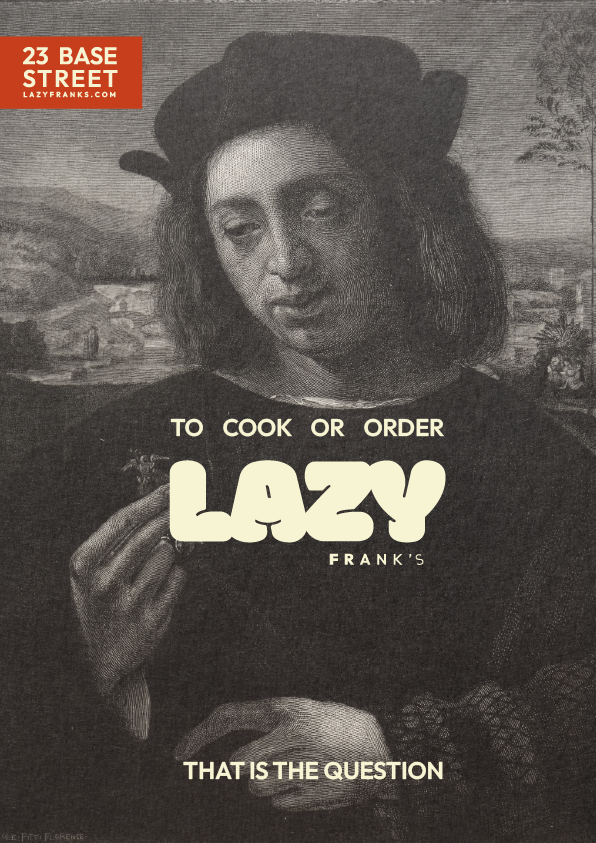
Thought Process: My idea plan was to base the brand around a laid back italian summer, using vintage photos, when searching for the photos I stumbled across these ‘Italian Masters’ paintings in the archives and they all kinda looked like they could do with a slice of pizza.
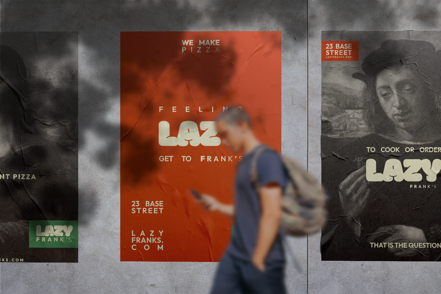
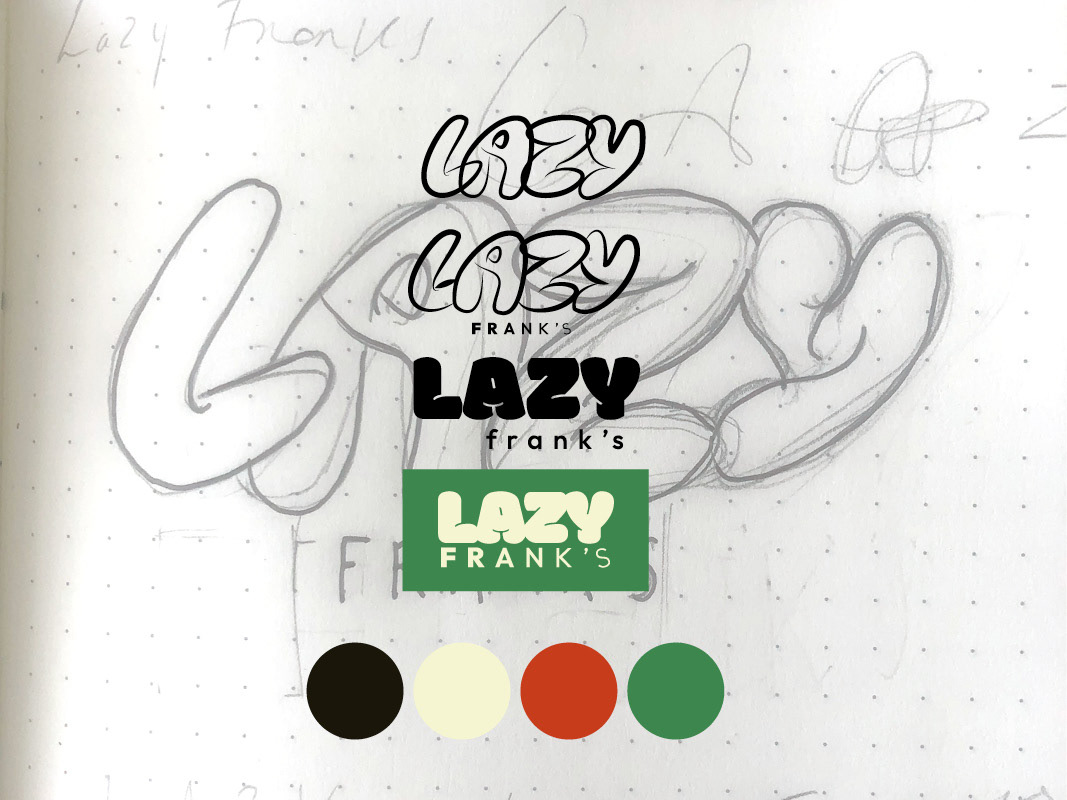
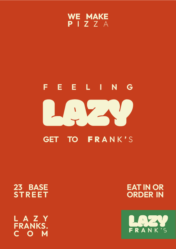
Colours: Kept it simple using colours from the Italian flag with slight adjustment to give them a softer feel.
Font: I wanted a cozy lazy feeling font so sketched it out and then as an alternate option decided to go for a similar existing font for a slightly more polished look with the same lazy cosy characteristics.
Tone of voice: I wanted the the tone to be quite light hearted, blunt and simple (admittedly, a lot of inspiration taken from hungover internal monologues). Lazy franks is for when simply want pizza and you want it now and you can't beasked to cook, everyone has those days.