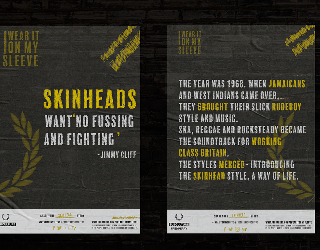

Brief: Create a unique brand identity that will communicate their inclusivity and love for individuality.
Concept: Don't Fit in, Be Bold.
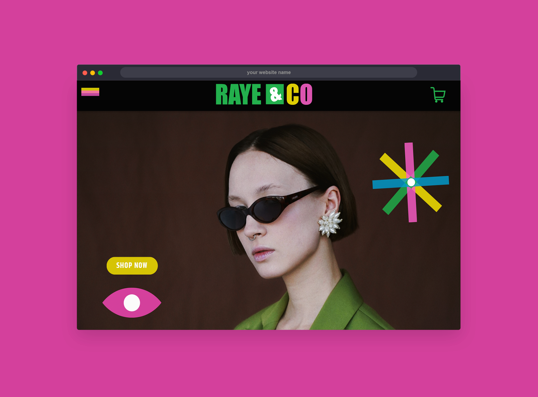
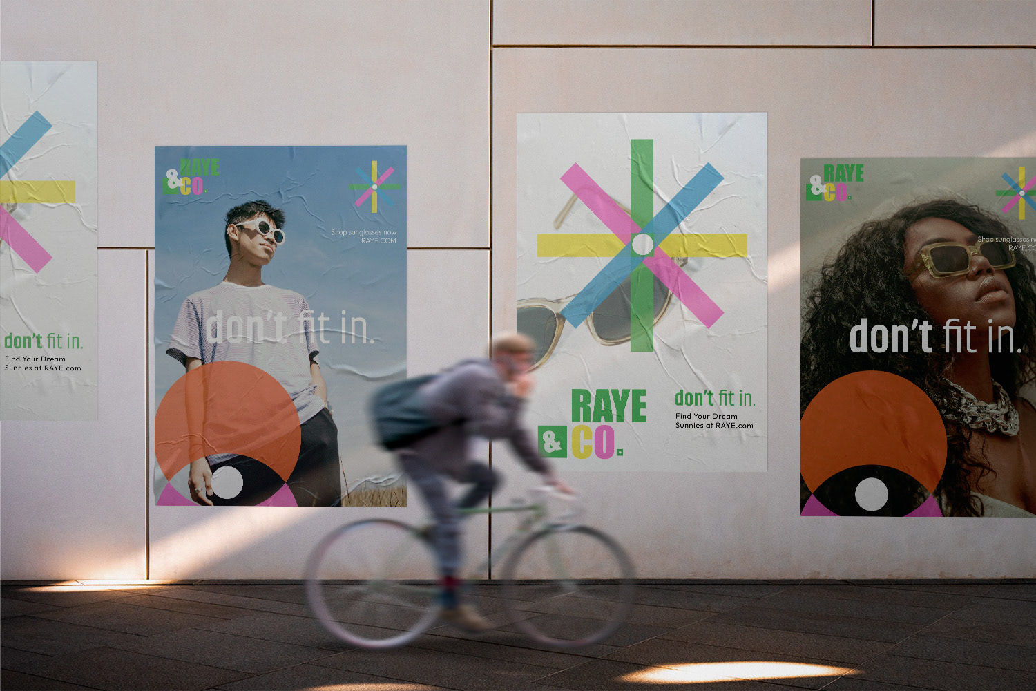
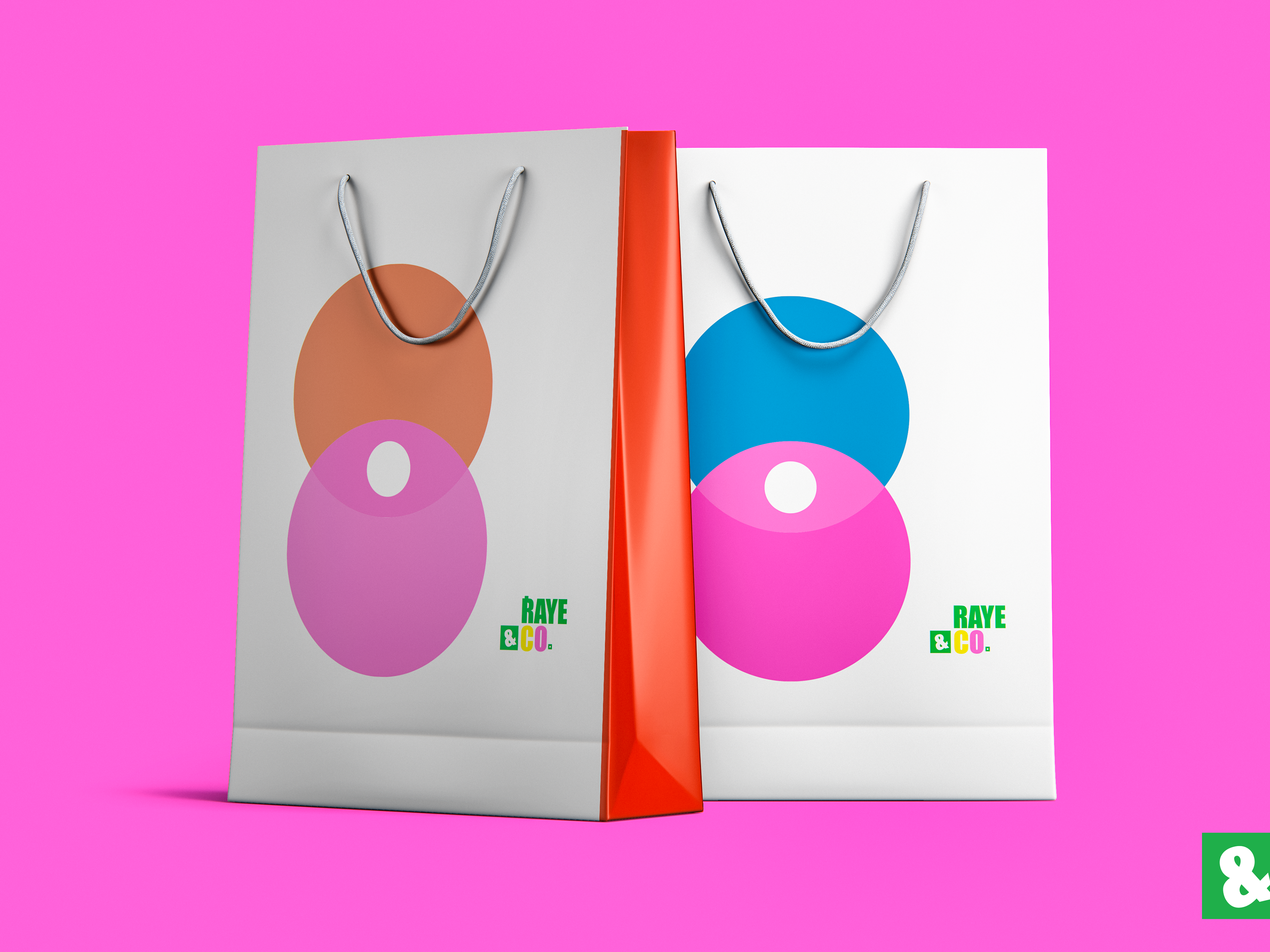
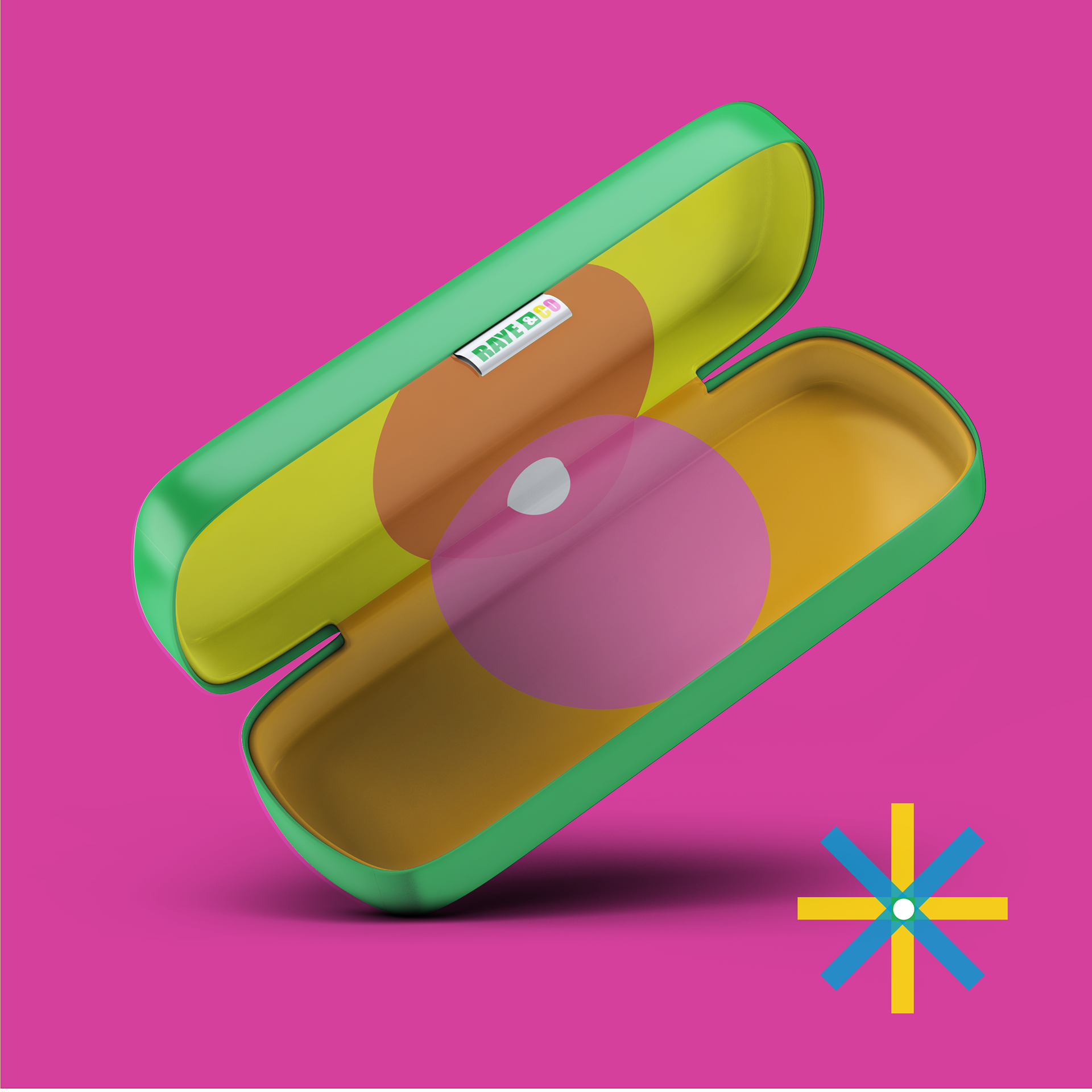
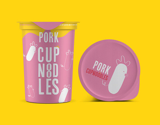
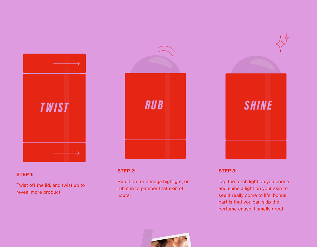
Design: Bold type and bright colours. I took inspiration from risoprint as the the overlap of colours always reminds me of old 3D glasses. but print there are so many different colour combinations you can use to create unique colours and creations and i feel like that was a good representation of the brand.
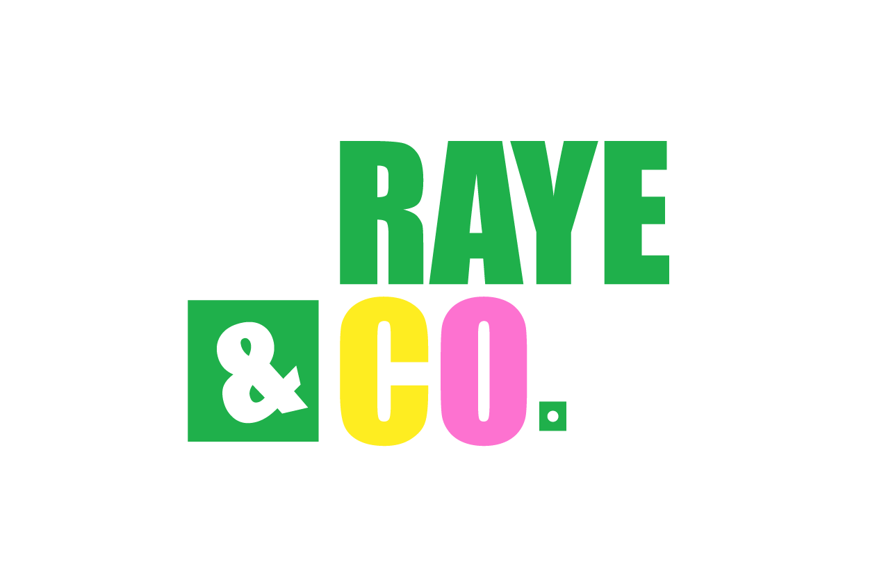
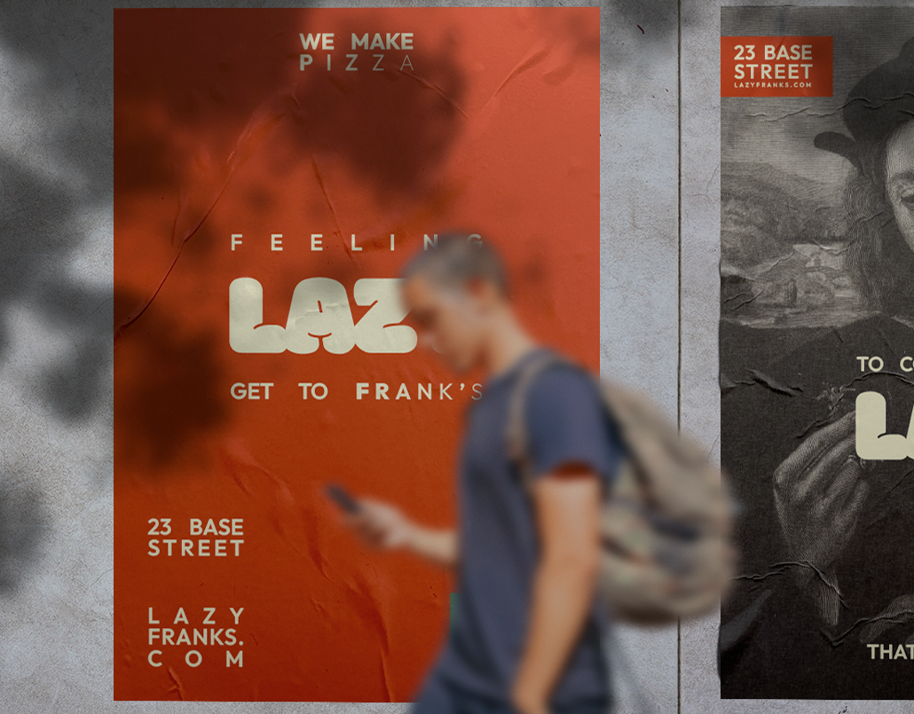
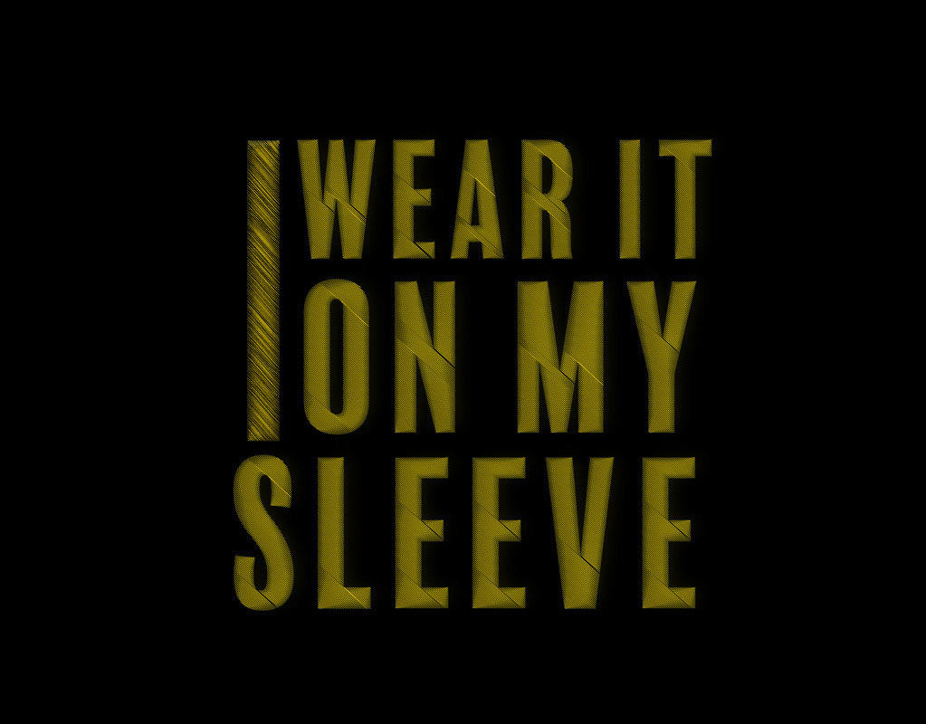
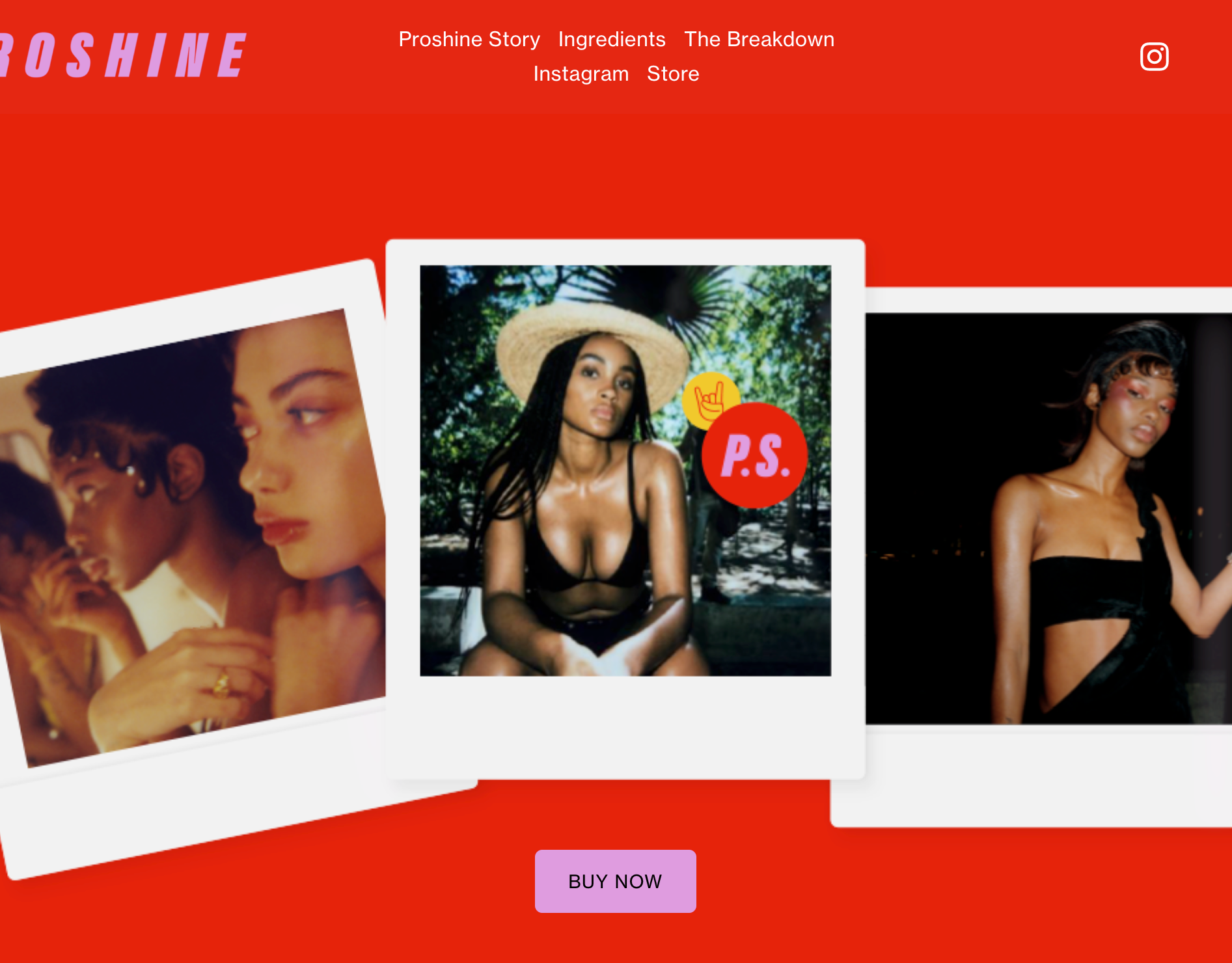
Having the Logo off centred with the box off to the side allows you to play around with the idea of thinking outside the box, you can see this in alternate logo on the posters below.
Having the Logo off centred with the box off to the side allows you to play around with the idea of thinking outside the box, you can see this in alternate logo on the posters below.